_chart Display Options
The _chart routines for bar charts, pie charts, and line graphs all use a common set of display options. These allow you to customize the appearance of the individual charts.
All options have a default setting that is noted below. You only need to explicitly set options when you wish to override these default settings.
The Options Object
All options are defined as properties of a JavaScript object. For example:
var options = {
 BarGap: '.15in',
 LegendFont: {bold:true, size:10},
 colors: ['orange', 'coral', '#FF0000', 'brown']
};
Each option, such as LegendFont or colors, is followed by either a single value, an array of values surrounded by square brackets, or a set of sub-options enclosed in curly brackets. Measurements, the gaps between objects, thickness, etc. use standard DocOrigin script units (an integer size in microns or a string with units, such as 250000, '.25"', '.25in', '.25cm' etc.) Colors are standard DocOrigin script colors (either a 6digit hex RGB code or one of the default color names). See the DocOrigin Colors section for more information.
All option names such as BarGap, ChartGap, etc. are case-insensitive. For example, BarGap, bargap, and BARGAP are all acceptable.
AutoZero: false
(As of 3.0.002.05) When set to 'true' bar charts will always start to 0.0 rather than their minimum value. Or, more precisely, charts whose minimum value is greater than zero will instead be drawn with zero as the minimum. charts with a maximum value less than zero will be drawn with zero as the maximum. Only applies to bar charts. You may also explicitly set the min/max values using theMinValueandMaxValueoptions.BarGap: '.15in'
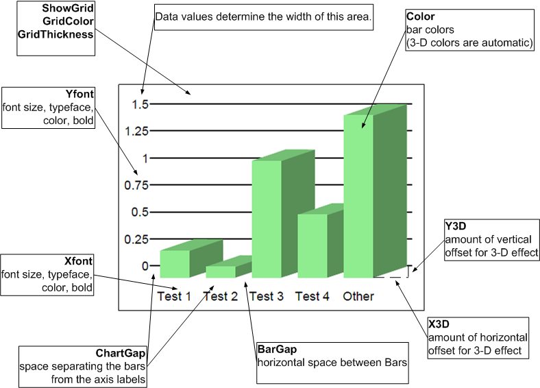
This is the space between each set or group of bars on a bar chart.ChartGap: '.05in'
This is the "margin" around the actual chart or graph. This space separates the chart from the X-axis and Y-axis labels and from the legend if it is present. You can set all four gaps using theChartGapsetting, or set them individually usingChartGapBottom,ChartGapTop,ChartGapLeftandChartGapRight.Color: ['red', 'green', 'blue', 'yellow', 'magenta', 'cyan', 'orange', 'lightgreen', 'lightpink', 'lightblue']
This sets the colors of bars, pie slices, or lines (depending on the type of chart). Colors are used sequentially. If more colors are required than have been defined the system will automatically re-use the defined list of colors but make them slightly darker. You can also use the Hex color codes such asColor: ['#B467DC', '#007CDC']. You can also setColor:'grayscale'to cause only shades of gray to be displayed.ColorColumn: 0
(As of 3.1.001.12) (Bar charts only) Specify a column in the data array (first data value is column 1) which specifies the bar color for each row of data. This specifies a particular bar color for each bar, as opposed to the normal assigning different colors to each column of data in a multi-column data set. The number in columnColorColumnis an index into theColorarray above. For example, a value of2in theColorColumnwould cause that bar to be displayed inblue(color 0 isred, color 1 isgreen, color 2 isblueetc.) See also theLegendLabelcommand which allows you to specify what each of these colors means.DatasetNames: {start:1, every:1, tickStart:1, tickEvery:1}
(As of 3.1.001.04) This setting controls how the main axis of data records is labeled. This is the bottom axis of a vertical bar chart or line chart, or the left axis of a horizontal bar chart. You can control which axis labels are displayed and which are left out. This can be useful if the labels tend to run together or overlap due to space constraints.(As of 3.1.001.07) The
tickStart/tickEverysettings affect the small tick marks displayed on the bottom axis of line charts. This is of use when there are many data samples and the tick marks start to blur together.
For example, if you have several data records labeled '2005', '2006', '2007', etc., you can specify that every 3rd label starting at 2006 be displayed, by setting:DatasetNames: {start:2, every:3}, // labels 2006, 2009, 2012, etc. Or set tick marks every 5 data items DatasetNames: {tickStart:1, tickEvery:5}, // tick marks every 5th item.DrawEdges: true|false
Should bar edges be drawn? Iftruethe border of bars in a bar chart will be outlined in black. Iffalsethey will not be. When drawing normal bar charts, this setting default to true. When drawing 3D barcharts, this setting defaults tofalse. Note that drawing the edges of a 3D bar chart may be visually incorrect if the bars overlap.Feature: null
Used with pie charts to highlight or "feature" selected pie slices. This is done by offsetting the slice outward from the center of the pie chart by a distance ofFeatureOffset. To feature a single data item, set Feature to the data item name. If you want more than one item featured, set Feature to an array of data item names. For example:Feature: '2003', // features single data item named '2003' Feature: ['2003', '2006', '2007], // feature several items
If you want all items featured, set
Featureto '*'. Bar charts will also allow Feature values. The bar chartFeatureFontwill be used typically to change the color.FeatureColor:(none)
IfFeature: above is set andFeatureColoris set, a bar chart will display the bar in this color. Use this to highlight one or more bars in a bar chart. If not set, the bar will be in its normal color. See alsoFeatureFont.FeatureFont: {size:8, face:'Arial', bold:false, italic:false, color:'black'}
This is the font settings used to label the featured data specified in the Feature setting above.FeatureOffset: 0
Explicitly specify the distance to offset a featured pie slice from the center of the pie chart. If this value is 0 (zero) a reasonable offset is automatically applied.GridColor: 'black'
This is the color of any grid lines that are drawn on bar charts or line graphs.GridThickness: '.01in';
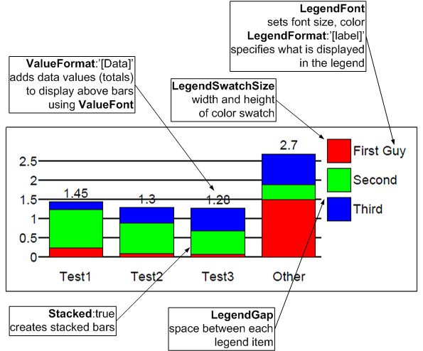
This is the line width for any grid lines that are displayed.LegendFont: {size:8, face:'Arial', bold:false, italic:false, color:'black'}
This font is used for all Legend text.LegendFormat: '[label]'
The text displayed next to each color square on the legend is formatted according to this setting. Formatting is done by taking theLegendFormattext string and replacing any text displayed in [square brackets] with the named data or value. For example, settingLegendFormat:'[label]'will display the label text associated with the specified item.LegendFormat:'[data]'will display the actual data value. Not all substitutions are available or make sense for every type of chart. The following substitution parameter are available:[data]- the actual data value represented by the legend color.[data format]- as above, but with an explicit format specification.
The format part is an actual number formatting designation. It can be a standard C-like format string such as %f, %f6.2, %d, etc. or "D", "I" or "$" to cause formatting using the current Locale of the chart canvas object. "D" formats as a decimal number, "I" as an integer, and "$" as currency.[label]- the data name.[percent]- for pie charts, the percentage represented by an individual pie slice.[percent1]- same as [percent] but displayed to 1 decimal point.
Note that ifLegendFormatis set to null a legend will not be displayed.
LegendGap: '.05in'
The vertical space separating legend items.LegendLabel: ['name0', 'name1', 'name2', ...]
(As of 3.1.001.12) Assign text to be used on each legend entry. The array of names must correspond to theColorarray. When using theColorColumnoption, this option is required if you want to display a Legend.LegendSwatchSize: '.2in'
The size (width and height) of the color swatch drawn as part of the legend.
To disable the Legend, setLegendSwatchSizeto'0'and leaveLegendLabelempty:LegendLabel: [''], LegendSwatchSize: '0'
LineThickness: ['.02in']
(Line graphs only) This is the thickness of each line drawn. This must be an array with one entry for each data set (line) that is drawn. If there are more graph lines than settings, the first value in this array will be repeated for all missing settings.LineStyle: ['solid', 'dash']
(Line graphs only) A list of line styles for each data set (line) to be drawn. Choose from styles of'solid','dash','dot'or'dotdash'.MarkerColor: ['black']
(Line graphs only) You can specify that a marker symbol be drawn at each data point.MarkerColoris the color of that marker. This is an array with one entry for each data set (line) that is drawn. If there are more graph lines than settings, the first value in this array will be repeated for all missing settings.MarkerSize: ['.05in', '.08in']
(Line graphs only) The size (width and height) of the marker symbols. This is an array with one entry for each data set (line) that is drawn. If there are more graph lines than settings, the first value in this array will be repeated for all missing settings.MarkerStyle: ['box', 'star']
(Line graphs only) The style of marker symbol to display at each data point. Choose from style of'none','box','star','openbox','diamond'or'vline'. This is an array with one entry for each data set (line) that is drawn. If there are more graph lines than settings, the first value in this array will be repeated for all missing settings.MaxValue:
(As of 3.0.002.05) Explicitly set the value of the "top" or maximum range of the data values displayed on a bar chart. By default, if this value is not set, the topmost position on the bar chart is defined by the maximum data value in the data array. This option allows you to override that value. TheAutoZerooption can also influence the range of values of a bar chart.MinValue:
(As of 3.0.002.05) explicitly set the value of the "lower" or minimum range of the data values displayed on a bar chart. By default, if this value is not set, the lower position on the bar chart is defined by the minimum data value in the data array. This option allows you to override that value. TheAutoZerooption can also influence the range of values of a bar chart.Pattern: 'None'
Color bars or pie slices can be displayed as crosshatch styles rather than solid colors. (This may be desirable on monochrome printers). If a single pattern is specified it will apply to all colors. If an array of pattern names is specified it will be applied in sequence to each of the data colors. Pattern choices are'None','Horizontal','Vertical','Crosshatch','Diagonal','ReverseDiagonal'and'DiagonalCrosshatch'.PieRound: true
If set totruepie charts will be round and scaled to fit the available space to the maximum. If set tofalsethe pie chart will be elliptical - stretched horizontally and vertically to fit the available space.PieStartAngle: 0
For pie charts, this specifies where the first data item starts visually on the chart. This is an angle measured in degrees clockwise from the top or positive Y position.RangeFormat:null
The left Y axis of a vertical bar chart or the bottom X axis of a horizontal bar chart is known as the Range axis. The numerical values displayed on these axes are formatted according to theRangeFormat.nullindicates a default integer/decimal number in standard North American dot-for-decimal notation. You can also setRangeFormatto an explicit c-like format such as%f6.2. SetRangeFormatto$to format as currency in the Locale of the chart canvas object. SetRangeFormatto D to format as a decimal number in the Locale of the canvas object. SetRangeFormattoIto format as an integer number in the Locale of the canvas object.ShowBarValue: false
(As of 3.1.001.04) Set totrueto display text value of barcode over top of the bar.ValueFormatmust also be defined. The text will not be displayed if it doesn't fit inside the bar. You can change the font size etc. using theValueFontsetting.ShowBarValueAtEnd:true
(As of 3.1.001.04) Set totrueto display text value of barcode at the end of the bar (above it for vBar, to the right for hBar).ValueFormatmust also be defined.ShowGrid:true
Should grid lines be drawn on the chart or graph?ShowXAxis:true
(As of 3.1.001.04) Set tofalseto suppress displaying any X-axis (bottom of chart) labeling.ShowXTicks:true
(As of 3.1.001.12) Whether to display small tick marks above the labels on the X (bottom) axis. For backward compatibility, vertical bar charts have a default of false and do not show tick marks.ShowYAxis:true
(As of 3.1.001.04) set tofalseto suppress displaying any Y-axis (bottom of chart) labeling.ShowYTicks:true
(As of 3.1.001.12) Whether to display small Tick marks beside the labels on the Y (left) axis. For backward compatibility horizontal bar charts have a default of false and do not show tick marks.Sort:false
Should the data items be sorted? Sorting will be from the largest to smallest value. If the data set has more than one data value (multi-line charts or multi-bar charts) only the first data "column" is sorted.Stacked:false
For bar charts with multiple data values for each set of bars you can choose for each to be a separate adjacent bar or that all values be stacked in a single bar.SuppressColumn: []
(As of 3.1.001.09) When you have multiple columns of data in the data array, you can cause one or more to NOT be charted using this option. Supply an array of column numbers of the data array that should not be displayed. For example [2,3] will remove the 2nd and 3rd column of data. Use this option when the same dataset might be used for different charts, or removal of a column of data is inconvenient.ValueFont: {size:8, face:'Arial', bold:false, italic:false, color:'black'}
This is the font used to display the actual value of each bar, pie slice, or line data point.ValueFormat:null
String to be displayed above each bar in a bar chart, or within each slice of a pie chart, or above each data point in a line graph. Formatting is done by taking theValueFormattext string and replacing any text displayed in square brackets with the named data or value. For example, settingValueFormat: "[data]" will display the data value associated with the specified item.
Not all substitutions are available or make sense for every type of chart. The following substitution parameter are available:
[data]- the actual data value represented by the bar, pie slice, or line data point.[data format]- as above but with an explicit format specification. The format part is an actual number formatting designation. It can be a standard C-like format string such as%f,%f6.2, %d, etc. or D,Ior$to cause formatting using the current Locale of the chart canvas object. D formats as a decimal number,Ias an integer, and$as currency.[label]- the data name.[percent]- for pie charts, the percentage represented by an individual pie slice.[percent1]- same as[percent]but displayed to 1 decimal point. IfValueFormatis set tonull, no text will be displayed. If the text doesn't fit totally inside a bar chart bar or a pie chart slice, it will not be displayed.
X3D: 0
If non-zero, this sets the amount of "shadow" or 3D effect in the X (horizontal) direction. A typical setting might be ".3in". Bar charts are drawn as 3D bars when eitherX3DorY3Dare non-zero.XFont: {size:8, face:'Arial', bold:false, italic:false, color:'black', angle:0}
This is the font used to annotate the X-axis along the bottom of bar charts and line graphs. Note that for vertical bar charts and line charts you can specify a rotation angle for the text in the range of -90 to 90 degrees.Y3D: 0
If non-zero, this sets the amount of "shadow" or 3D effect in the Y (vertical) direction. A typical setting might be ".1in". Bar charts are drawn as 3D bars when eitherX3DorY3Dare non-zero. Pie charts are drawn as 3D using onlyY3D.YFont: {size:8, face:'Arial', bold:false, italic:false, color:'black'}
This is the font used to annotate the Y-axis along the left side of bar charts and line graphs.