Fillable Forms
DocOrigin enables a number of interactive or "fillable" features to be used with HTML forms. These features allow Merge to generate standard multi-page documents where certain fields are fillable. The document can also contain many interactive controls such as Pushbuttons, Checkboxes, Radiobuttons, and Selection/Choicelist controls. Typically, the document has a "submit" button that posts the collected data to a web server.
Note that DocOrigin does also provide some limited input capability with PDF forms. This includes basic field data capture as well as checkbox handling. At present PDF fillable forms do not support the dynamic addition, removal, hiding and showing of panes (whereas HTML fillable forms do support that). Although the following information is aimed at HTML input forms, the PDF capabilities will be noted when applicable.
This documentation page is about designing a fillable form and then generating that document. There is another part to fillable forms usage; that is the part that is performed outside of DocOrigin, in the applicable viewer technology. Further discussion of that area will be found at Fillable HTML Forms and Fillable PDF Forms. There is most likely yet another part in the fillable forms puzzle, the part that lives on the web server that is hosting the fillable form. DocOrigin provides some sample, unsupported, PHP scripts in the .../DO/Samples/Web folder but really the web server portion is left entirely to you.
Single Output File
One of the unique features of DocOrigin Fillable HTML Forms is that all of the components necessary for the html form are output in a single HTML file. Typically, web pages combine a variety of separate server files - style sheets, html, jpg files, etc. With DocOrigin Fillable Forms all these pieces are embedded in a single file. This simplifies deployment and update of the online forms.
Templates
The HTML output structure is defined by a template file. This is a skeleton .htm file that defines the structure and base contents of the html file. It has special markers such as HEADER in it that are expanded by the Merge driver into the actual contents of the document. Use of a template allows a system integrator greater control over such things as standard headers or footers, Doctype records etc. A standard (default) template is provided in the DocOrigin install in the ../DO/Bin folder. A Merge command option of -template xxx allows that to be overridden with a custom template if you wish.
HTML Script
DocOrigin uses HTML JavaScript to perform many of the operations. This script gets embedded into the output html file as part of Merge's processing of the HEADER and FOOTER tags in the template. There is a standard set of DocOrigin supplied script routines that can be accessed in the form design to perform actions such as submitting the form data to a server or inserting an option detail pane into the document. For convenience, these routine names are all prefaced with "DO." - such as DO.submitForm(), DO.addPane() etc.
You can also create your own script and add it in a number of ways:
- By defining functions in the Form object's script Input event.
In Design go to File>FormProperties select the Script button then the Event:Input option. Any script typed into this section will be inserted into the generated HTML file and can be called by your Input field event processing.
- By creating a custom Template and inserting the script into the template's section.
Script is typically stored as JavaScript functions that can be called by the onclick, onblur, etc. events by setting the ViewerAttributes information for a button field. See Pushbutton Fields below.
Input Fields
When Fields have the Input flag set they are considered to be HTML (or PDF) Input controls or buttons. Input fields then allow the setting of a number of additional settings which control the input process. These are found by clicking on the Input button at the lower-left of the Field property page.
All other settings are filled and managed like regular Merge data fields. The input fields are also processed just like all other Merge fields - merging data, affecting layout, etc. prior to being sent to the print driver. In this respect, Input fields are no different than any other Merge Field. It is only at the final print driver stage itself that their special status as Input fields are recognized and acted upon. To set the type of Input field and other options within Design you must click on the Input button under the Field's property tab. Note that this button is not activated unless the Input checkbox at the top-right has also been checked.
If you select an Input Field (one where you've checked the "Input" checkbox at the top of the Field screen) and you select the Input button at the bottom left of the Field Properties screen (or select the Format > ObjectProperties menu command) you will see the following screen:
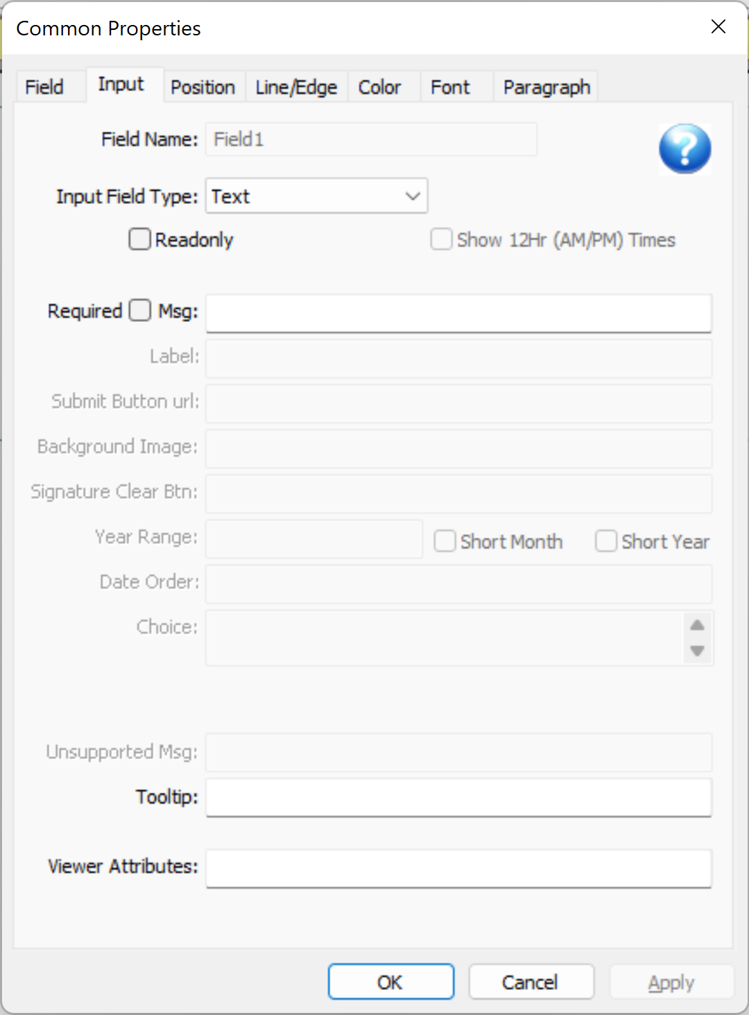
The Field Name field at the top if for information only - you can change the field name elsewhere in the usual manner.
The Input Field Type setting indicates how the input is collected. There are several choices. The list of choices is dependent on the field's Display As setting on the standard Field screen. For instance, Signatures and uploaded images are only available if the Field Display As setting is "Image". Radio Buttons and Checkboxes work similarly.
The settings that are greyed indicate non-applicable settings for the particular Input Field Type you have selected.
The Viewer Attributes section at the bottom of the screen is pass-through information to the browser and is typically used to trigger an action such as the HTML onclick event of a Submit button. This is where the onclick event would be specified for a submit button for instance.
The various options are listed in more detail below:
Required and Readonly Input
The Required and Readonly settings are available for most input types. When the Readonly option is checked the user is NOT able to change the data. This is roughly equivalent to having placed a similar standard non-input field on the form - it is displayed but not changeable. Readonly can be of use when you want the same DocOrigin form to sometimes collect data from the user and other times echo it back to them in the same format. Although the data is not changeable by the user, it is passed through to the web server as it would normally be.
The Required setting indicates that some value must be entered in a field. When a form is about to be submitted to a web server, any Required fields are highlighted to the user. The form will only post data to the server when all Required fields have data values. The associated Required Msg field can be used to override the default message with a custom one. This allows for language localization or expanded explanatory information.
Input Field Type
This is the type of input experience you want for your user. This can be as simple as a basic Text input or more elaborate such as Date where the user selects day, month, and year or a Signature input field where you can sign using a tablet/stylus or mouse.
Fieldtype Checkbox
This creates checkbox input field. DocOrigin checkboxes will always Post either 0 (off) or 1 (on) to the server - unlike standard html checkboxes which send nothing when the box is not checked. The Design Initial Value setting, or Merge field data value determines the initial state of the checkbox - a blank, 'n', 'N', or '0' will default to off (0) anything else defaults to on (1).
The value sent to a web server for a checkbox will always be either 0 for unchecked or 1 for checked.
The checkbox Caption is set on the standard Field Object Properties screen.
Fieldtype Choicelist
The Choicelist input field displays a drop-down list of choices for the user to select from.
The Choice option is used to define the list of choices. Each choice consists of a value to be submitted as well as the text to be displayed to the user as the description of the choice. For example:
a:"first choice" b:second c:"none of the above"
Would display three choices - "first choice", "second", and "none of the above" to the user. If the second choice was made, the value "b" would be submitted to the server.
If the value of the Merge field (using either the Design's Initial Value setting, or Merge data, or Merge script) is one of these submitted values (a, b, c in this case) - that item will be pre-selected when the form is first displayed.
Fieldtype Date
An input Date field allows a user to enter a date. The Date is selected from 3 drop-down lists - year, month, and day of month. The various Date options allow you to control the appearance of these lists.
The Date Order option lets you specify which order the year, month, and day are displayed.
year month day (the default order)
y m d (can be abbreviated)
d m (omit one or more of the choice lists)
The Label option is used to assign a default label or title to each of the dropdown selectors. It should be a list of titles in the same sequence as the Date Order settings (above). If the entire Label setting is left blank, default settings we be provided. The labels are displayed as default, non-selectable, grayed text when the control is first displayed.
The Year Range setting is used to specify what year or years to display in the year choicelist.
1950-2014
2014-1950 (so 2014 is at the top)
2000 (a single fixed year)
The Short Month option uses names such as "Jan" or "Feb" rather than "January" and "February".
The Short Year option displays "08", "09" rather than "2008" and "2009".
The month names are determined based on the Locale setting of the field. Setting Locale to German will result in German names for the months to be displayed.
If the Merge process results in a recognizably formatted date string (yyyy-mm-dd is a good one), this date is set as the default value.
The submitted value of a Date field is always in the form of yyyy-mm-dd as in 2014-12-25.
Fieldtype Email Address
This displays an input field that expects an email address to be entered. Validation is browser-dependent.
Fieldtype File
This creates an input field for uploading a file's contents to the server.
Fieldtype Hidden
This creates a "Text" field that is not displayed, but does submit it's contents to the server. Typically used to pass additional data to the server.
Fieldtype Image
An input Image field is used to upload an image to the server. The image is also displayed or previewed to the user.
Fieldtype Password
This creates a "Password" text field - where the text being typed in is obscured by the browser. Otherwise acts at a Text input field.
Fieldtype Pushbutton or Submit Button
A button is displayed to the user. Typically used to send data to a web server.
The Label option is used to specify the text on the buttons (such as "Click Here"). If the Label option is not set, the current Merge field value is used as the label. Alternately the Background Image option can specify the name of an image file that will be displayed as the button. This filename should have a fully qualified path.
Note that Background Image can be forced to reference a file on the server by setting Merge command line "-embedimages N". Otherwise the image file is assumed to be on your computer at the time Merge is run - and is embedded into the html file.
Fieldtype Radiobutton
This creates one of a (potential) set of radio buttons that the user can select from.
Radiobuttons are generated and defined within DocOrigin somewhat differently than they are in standard HTML. Each Radiobutton Field within DocOrigin is a distinct field object. When Merge merges data it expects a data value for every button. (These of course can also be set in Design via the Initial Value setting.) To group these distinct fields so that they act as a typical input radio buttons (click one, the others are turned off) you must give them all the same DocOrigin Field name.
When Merge prepares to create Fillable input radio buttons it checks for radiobutton fields which have the same Field Name and are within the same parent Group or Pane. These will be treated as a radiobutton group. Alternately any radiobutton which is the only radiobutton within a Pane or Group of that name will get grouped with other similar "lone" radiobuttons of the same name. This allows (for example) a series of repeated Panes each with a single radiobutton the "selects" that pane.
The data stream to Merge typically contains separate field values for each radiobutton. These values control whether the input radiobutton is initally On or Off. Input values of '0', 'N', 'n' or blank are interpreted as Off - anything else is On.
When radiobuttons are Posted (submitted) to a web server each radiobutton will be individually sent with a value of '0', 'N', 'n'. Note that this is different from how standard HTML submits radiobuttons. DocOrigin ensures that every field, whether checked or not, is submitted to the server.
An additional field is also created and submitted for radiobutton groups - with a name of $DO_ followed by the DocOrigin field name - as in $DO_Type. This can be used to get an indication of which button was selected - similar to how standard HTML radiobuttons work. On each individual radiobutton field you can specify a Choice option string. The $DO_ field will be set to that choice string if the radiobutton is selected at submit time. Both the $DO_ field and the individual button field values are sent to the server.
Fieldtype Signature
A Signature input field is one where a user can physically sign their name. This is typically done using a tablet - although a mouse can also be used.
The Signature typically includes as "Clear" button at the top-right for the user to erase what he's drawn and start again. The label assigned to this is an "X" - but you can change this using the Signature Clear Btn option.
The Background Image option can be set to the name of an image file on your computer. This acts as a "watermark" or background to the signature control. It is NOT sent to the server as part of the user's signature.
When a Signature input field is set to Readonly, the Clear button is NOT displayed and the signature cannot be altered.
Fieldtype Telephone Number
This displays an input field that expects a telephone number to be entered. Validation is browser-dependent.
Fieldtype Text
A normal text input field. Both single-line and multi-line fields are supported - depending on the Field Object Property setting for "Single Line".
Fieldtype Time
Allows user input of a Time
Times are input by selecting from two drop-down lists - hour and minute. If the AM/PM option is selected, a third AM/PM choice list is also displayed, otherwise, the hour selection is of a 24-hour clock.
The Label setting can specify a label for the hour and minute choice lists - similar to the Date input field.
Fieldtype URL Address
This displays an input field that expects a syntactically correct URL address to be entered. Validation is browser-dependent.
Tooltip
The Tooltip allows the specification of a Tooltip popup message for a field. When the mouse hovers over the field in either PDF or HTML forms this message is displayed.
Viewer Attributes
The ViewerAttributes settings are typically used to set actions to be performed by the browser based on standard html events. For example:
onclick="DO.submitForm()"
could be used on a submit button to call the standard DocOrigin submitForm function when the user clicks on the button. The ViewerAttributes text is actual HTML that is inserted as-is into the HTML output stream - it must be correctly formatted HTML.
The ViewerAttributes can also be defined within standard Merge script by setting the _viewerAttributes property of a field.
PDF Viewer Attributes
For PDF fillable forms, the viewer attributes of a pushbutton field could be simply the URL of form submission target.
It might also take the form of:
onclick="myFunction(my args)"
That presumes that you have used the PDF Input event of the form object to script in a function named myFunction. PDF also uses JavaScript. A fabulous resource for defining JavaScript functions for use in PDF is the: JavaScript™ for Acrobat® API Reference. Do check out its various submitForm capabilities and its abilities to enumerate the fields on a form, plus its XML handling.
Data Field Naming Convention
The DocOrigin html driver treats the entire form as a single html <form> structure. When data is submitted it is typically POSTed to a server address. Data names are fully-qualified data names. Here is a sample of some data that was echoed back in the browser from a simple php test utility called echo.php (found at www.docorigin.com/echo.php):
$DO_formName = 'DynaDemo'
page-1:AllDetails:Detail#1:Item = '1'
page-1:AllDetails:Detail#1:Description = 'A fancy item'
page-1:AllDetails:Detail#1:Qty = '1'
page-1:AllDetails:Detail#1:Amount = '$42.00'
page-1:AllDetails:Detail#2:Item = '2'
page-1:AllDetails:Detail#2:Description = 'A standard item'
page-1:AllDetails:Detail#2:Qty = '3'
page-1:AllDetails:Detail#2:Amount = '$38.95'
page-1:AllDetails:Detail#3:Item = '3'
...
In this example, you can see that the first data field is $DO_formName. It contains the name of the form - the name of the <Form> root object assigned in Design, not the form's file name. $DO_formName will always be sent for all forms. If you did not rename it in Design it defaults to 'Form1'.
Data fields use the same names as were assigned in Design.
In this example, the form contains a pane called AllDetails which in turn contains repeated instances of subpane Detail. Because this pane occurs multiple times, the DO.submitForm() process gives each instance a unique name - Detail#1, Detail#2, etc. Within each Detail pane there are 4 fields - Item, Description, Qty, and Amount.
This naming structure results in unique names for all data fields. Your server application can parse this field naming structure as necessary to map the data to whatever format you require.